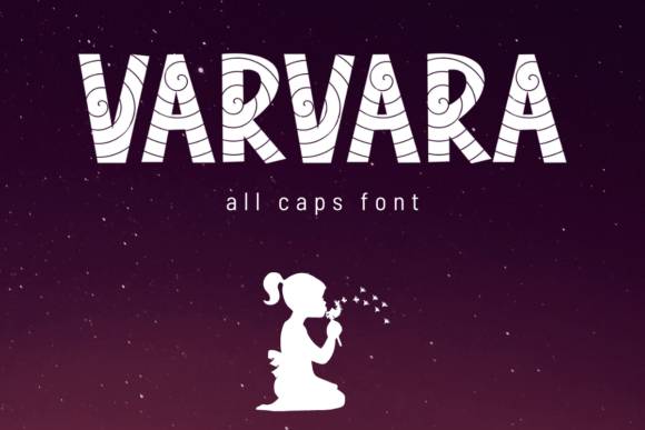
Varvara: A Bold Display Font for Web Designers and Digital Creators
Testing Varvara in a Real Web Layout
I recently had the chance to test Varvara while redesigning a client’s portfolio website. The goal was to create a strong visual identity that felt both modern and expressive. I dropped Varvara into the hero section as the main headline font, overlaying it on a full-width image banner. Right away, I noticed how the all-caps structure and sharp angles gave the design an instant sense of confidence and clarity. It wasn’t just a font choice—it became a design element in itself.
Varvara is a display font, which means it’s best used for short, impactful text. It’s not meant for long-form reading, but rather for headlines, callouts, and branding elements. That makes it perfect for landing pages, hero sections, and digital brand kits where you want to make a strong first impression without overwhelming the user.
Performance in Responsive Layouts and Mobile Views
One of the first things I checked was how Varvara held up on mobile devices. Typography can easily lose its impact when scaled down, but Varvara maintained its bold presence even on smaller screens. The clean lines and open spacing helped it stay legible without needing extra tweaks. I tested it across multiple devices—iPhone, Samsung Galaxy, and desktop—and it rendered consistently well across all platforms.
It’s also important to note that Varvara works well in responsive web design when paired with the right font sizes and line heights. On mobile, I adjusted the font size slightly and increased the letter spacing just a bit to keep the all-caps style from feeling cramped. These small changes helped preserve the font’s visual appeal without sacrificing readability.
Using Varvara in Hero Sections and CTA Areas
On the homepage, I used Varvara for the main headline: “Creative Work That Speaks Volumes.” It was placed over a subtle gradient background with a soft image overlay. The contrast between the dark background and the light font made the text pop, and the boldness of the typeface reinforced the brand’s confident tone.
For the call-to-action button below, I switched to a clean sans serif font to maintain readability and usability. This is a great example of effective font pairing—Varvara sets the tone, while the sans serif handles the functional part of the design. The combination felt balanced and intentional, which is key for good UX.
Pairing Varvara with Supporting Fonts
Font pairing is crucial when using a strong display font like Varvara. Since it’s all caps and has a bold personality, it works best when supported by simpler, more neutral fonts. I found that pairing it with a modern sans serif like Montserrat or Lato created a clean, contemporary look that worked well for both personal and business websites.
For more editorial-style layouts, I tried pairing Varvara with a serif font like Merriweather for subheadings. This gave the design a more refined, magazine-like feel. The contrast between the bold all-caps and the elegant serif created a visual rhythm that guided the eye naturally through the page.
Readability and Accessibility Considerations
While Varvara is visually striking, it’s not ideal for every part of a website. I avoided using it for navigation menus, form labels, and body copy. The all-caps format and decorative details can make it harder to read in longer blocks or at smaller sizes. It’s also important to check contrast ratios when using Varvara over images or dark backgrounds to ensure it remains accessible to all users.
For accessibility, I recommend using Varvara only for short, high-impact text elements like headlines, section titles, and branding statements. Always pair it with a highly legible secondary font for longer content. Also, make sure to test the font with screen readers and accessibility tools to confirm it doesn’t interfere with usability.
Best Use Cases for Varvara in Web Design
Varvara shines in digital spaces where visual impact matters. Here are some of the best use cases I found during my testing:
- Hero Sections: As a headline font, Varvara commands attention and sets the tone for the page.
- Landing Pages: Use it for titles and key messaging to create a strong first impression.
- Brand Identity: Incorporate Varvara into logo designs or branded banners for a modern, confident look.
- Call-to-Action Buttons: Works well for short, punchy CTA text when paired with a clean supporting font.
- Digital Campaigns: Perfect for promotional headers, social media graphics, and email banners.
It’s also worth noting that Varvara is well-suited for creative industries—designers, photographers, artists, and entrepreneurs who want to communicate a bold, modern aesthetic through their online presence.
Technical Notes and Font Licensing
Before deploying Varvara on a live site, I checked the font’s webfont formats and licensing. It comes in standard formats like WOFF and TTF, which are compatible with most modern browsers. I also made sure the font was optimized for fast loading and didn’t negatively impact page speed.
From a licensing perspective, Varvara includes commercial use rights, which is essential for client projects and branded websites. Always double-check the license terms before using any font commercially, especially if you’re embedding it in downloadable assets or templates.
If you’re using Varvara in a design tool like Figma or Adobe XD before coding, make sure to test how it renders in exported prototypes. I found that it previewed well across platforms and maintained its visual integrity in both design and development stages.